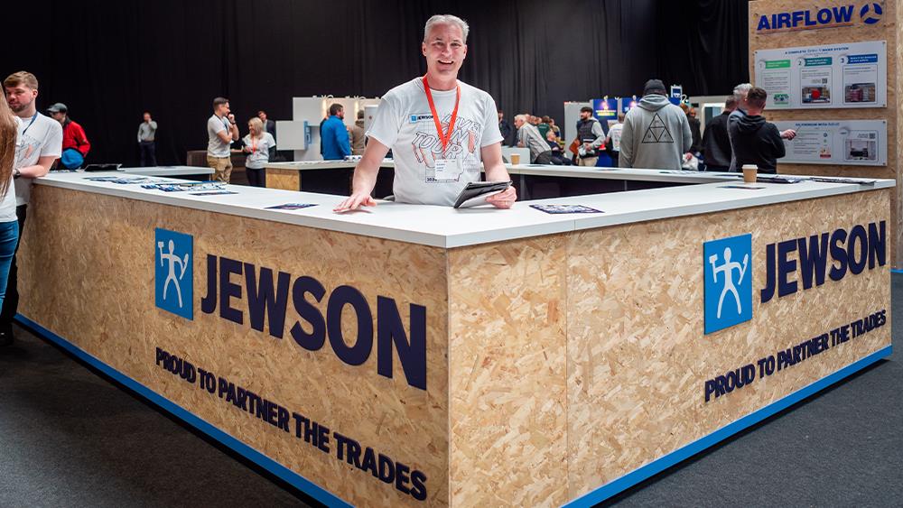

Jewson has announced that its Bridgwater branch in Somerset will be the first to be significantly refurbished in line with its company rebrand.
The company has implemented an investment programme to upgrade its branches across the UK, including major refurbishments and new purpose-built distribution facilities.
Stark UK, the relatively recent new owner of Jewson, explains that the introduction of the new brand identity, which was launched at its Jewson Live event, forms part of its Trust in Better strategy, “symbolising the improvements the company has been making to is value proposition for customers, including range, availability, price and distribution enhancements”.
At the outset of the refresh, customers will see the new brand reflected in the Jewson website, along with its regular communications; from delivery notes and invoices to the website and welcome packs.
Over the coming weeks and months, the new Jewson brand will be applied in branches, too, from promotional materials and bulk bags to property refurbishments and delivery trucks. The investment programme in branches will range from light-touch improvements to substantial refurbishments and new purpose-built ‘Branches of the Future’.
Bridgwater has been announced as the first branch to be fully refurbished in the new branding, with an upgrade to the products, services and facilities available to customers. Opening in May, Jewson Bridgwater will include several elements of the full ‘Branch of the Future’ concept that is in development, including customer meeting area, drive-in material pick-up bays, a food offering and specialist product services.
Customers will be invited to take a first look at the newly refurbished branch at an event in May.
Richie Rich, Branch Manager at Jewson Bridgwater, said: “The transformation project taking place here at Jewson Bridgwater is incredibly exciting, and we can’t wait to welcome customers in May to see our newly improved branch.”
Visually, the new identity, which is moving away from the company’s yellow, aims to be “a positive reflection of the fresh, modern and personal builders’ merchant we are becoming”, with the introduction of the figure of Anton, a personification of a hard-working builder, to the logo.
According to the company, the new colour palette “showcases dark and sky blue, underpinning the company’s commitment to nurturing high-quality customer relationships; a vibrant coral accent reflects Jewson’s fresh and innovative approach to merchanting. The use of coral is also synonymous with hi-vis jackets, a vital tool for tradespeople everywhere, and is therefore a symbol of our ongoing commitment to workplace safety.”
Stark UK is also about to introduce new visual identities for Major Build Solutions and Jewson Partnership Solutions.